Choosing paint color for your apartment is not just an aesthetic question. Color influences how you perceive the size of each space, your mood, and the overall sense of comfort you experience day to day. In 2026, trends point toward warmer and more organic palettes, where home dwellers seek spaces that feel welcoming without being overwhelming. This guide helps you make informed decisions, room by room, so that the result is practical, pleasing, and long-lasting.
Why color matters more than you think in an apartment
The color of your walls defines not only your decorative style. It also changes how you perceive space, the amount of light surfaces reflect, and the emotional atmosphere of each room. In urban apartments in cities like Madrid, Barcelona, or Valencia, where square meters are limited and natural light varies by orientation, choosing the right tone can make a real difference.
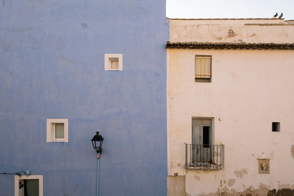
Cool tones like blues, greens, and purples help visually open small spaces, giving them freshness and a sense of width. Warm tones (golden beiges, soft terracottas, sandy hues), on the other hand, add warmth and make larger rooms or those with little light feel more inviting. Understanding these effects lets you compensate for your home's specific characteristics and get the most from every corner.
Recommended colors for each room type
Each room in your apartment serves a different purpose, and the color should support that function without dominating it. Below, you will find practical guidance for the most common spaces.
Living room: the balance between personality and versatility
The living room is the most multi-purpose space in an apartment. Here you receive guests, work, relax, and spend time with family. That is why the color should be neutral enough not to tire with daily use, but character-filled enough to add personality.
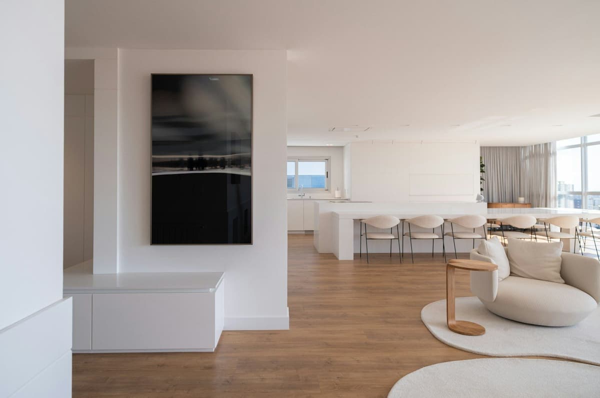
Trending colors in 2026 share a natural quality, warmth, and the ability to create spaces that convey well-being without feeling heavy, leaving behind the cold grays and off-whites of previous years. Golden beiges, warm sands, and creamy whites (like Pantone's Cloud Dancer) work especially well as a base. If you want to add visual interest, you can reserve one accent wall for a sage green or soft terracotta, tones that add character without overloading the space.
In living rooms with little natural light or north-facing windows, warm neutrals help offset coldness. If, on the other hand, plenty of light enters from the south, you can afford somewhat more saturated tones or even dusty blues, which bring freshness without losing warmth.
Bedrooms: prioritize calm and rest
The bedroom is your rest zone. Here, color should encourage relaxation and help you disconnect at the end of the day. Soft, low-saturation tones are most recommended: warm whites, pale beiges, pastel blues, mint greens, or stone grays.
Soft blues have a proven relaxing effect and are an excellent choice for east-facing bedrooms (where intense morning light enters). Sage greens, meanwhile, convey balance and connection with nature, and pair well with linen or cotton textiles.
If you prefer a bedroom with more character, you can choose earthy tones (clay, desaturated terracotta, cocoa brown), but always in soft versions. Avoid very dark tones in small bedrooms unless you deliberately seek an enveloping atmosphere and have good artificial lighting.
Kitchen and bathroom: durability, cleanliness, and light
The kitchen and bathroom have specific needs. Both are high-humidity areas and require washable paints with good resistance to splashes and condensation. As for color, light tones remain the most practical: whites, soft beiges, light grays, or very pale blues.
These colors reflect light better (crucial in interior bathrooms without windows), make cleanliness easier to perceive, and visually enlarge the space. If the kitchen or bathroom is a generous, luminous space, you can afford a somewhat more saturated tone on one accent wall (a misty blue, a light olive green), but always keep the rest in neutral tones.
Hallways and entryways: width and continuity
Hallways are usually narrow spaces with little natural light and ceilings that seem low. Here, light tones are your best ally. A warm white or very pale beige on the walls, combined with the same tone (or one slightly lighter) on the ceiling, helps create a sense of continuity and width.
If the hallway connects several spaces, it is a good idea to use a color consistent with what dominates in the adjacent rooms. This creates visual flow and makes the apartment feel larger and more orderly.
How to combine colors without risking the result
Combining colors in a small apartment can be risky if you lack experience. The safest rule is to choose a warm neutral as your base (beige, sand, creamy white) for most of the walls, and reserve tones with more character (sage green, terracotta, dusty blue) for one or two accent walls, or for secondary spaces.
This strategy lets you personalize the space without overwhelming it, and makes future decorative changes easier. Warm neutrals pair well with almost any furniture, textile, or accessory, and age better visually than highly saturated or short-lived trendy tones.
If you want more contrast, you can play with different finishes (matte, satin, semi-gloss)1 instead of very different colors. The same tone in matte finish on walls and satin on woodwork can add sophistication without complicating your palette.
Common mistakes when choosing colors for an apartment
One of the most frequent mistakes is choosing color by looking at only a small swatch or a digital sample. Colors change dramatically based on the light in each space, the time of day, and surrounding surfaces. Before deciding, paint a large sample (at least 50 x 50 cm) on the wall you are going to paint, and observe it for several days, in both natural and artificial light.
Another common mistake is forcing a color because it is trendy, without considering your apartment's characteristics. If your living room is small, dark, and north-facing, a dark emerald green can feel oppressive, no matter how on-trend it is. Always adapt your palette to your actual space, not the other way around.
Finally, many people underestimate the impact of finish. A color may look perfect in matte and too cold in satin, or vice versa. Keep in mind that matte absorbs light (ideal for hiding imperfections), while satin reflects it (adds brightness and is more washable, perfect for kitchens, bathrooms, and hallways).
What to do before you start painting
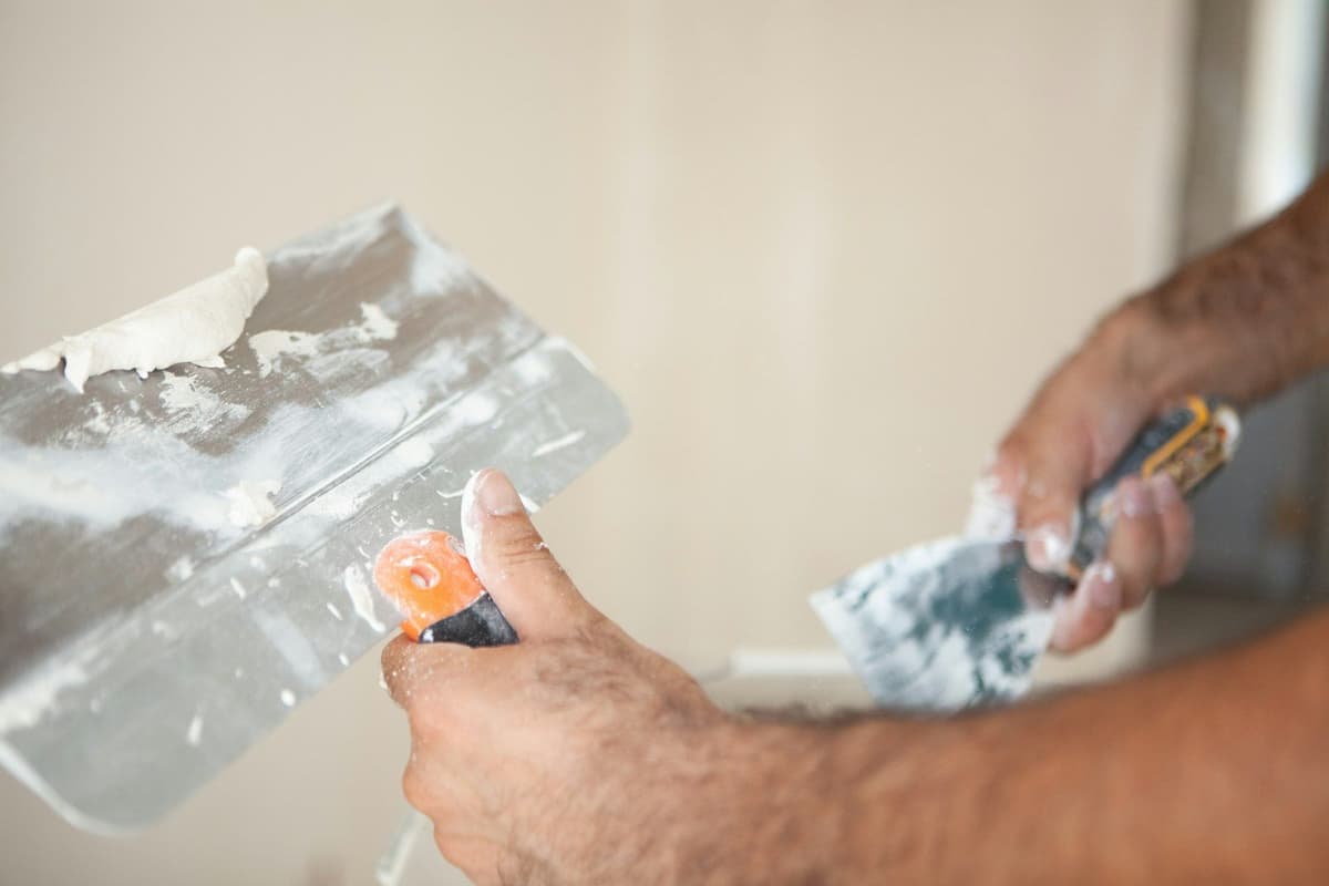
Before buying paint, make sure the walls are in good condition. Properly prepare the surfaces2: fill cracks, sand imperfections, clean dust, and apply primer if needed. A poorly prepared wall will make even the best color look neglected.
If you plan to hire a professional, request detailed quotes and make sure the painter has seen the space (via photos, videos, or a visit). Our platform always requests images of the surfaces before closing any quote, precisely to avoid surprises once work has started. The quote should include wall preparation, number of coats, paint type, and all associated costs3, with no fine print.
Make the decision calmly and test before painting
Choosing paint color for your apartment is a decision you will live with for years. Do not rush it. Visit specialized stores, ask for physical samples, test colors on your actual walls, and observe how they change with your home's light. If you are unsure between two tones, paint both on adjacent walls and live with them for a few days before deciding.
Remember that color does not exist alone: it interacts with your furniture, light, textiles, and flooring. A warm beige may look perfect on the swatch, but if your floor is cold tile and your furniture is gray, the final result may feel unbalanced. Think about the whole picture, not just the wall.
And if you finally decide to paint, make sure the work is done well from the start. A good professional will guide you on the best finish for each room, warn you if they detect wall problems, and deliver a clean, long-lasting result that meets your expectations.
Sources
External sources open in a new tab.